Friday, July 26, 2013

Happy Birthday Barney Bubbles!


Hey Kids- Before I get started, I want to let you all know that this will be my last post at this bolg spot. I'm going to start a new one that encompasses a more over all idea of art and culture, not just graphic design. It will also focus on more of my projects too. So, I'm thinking of a new name and will most likely have it up soon.

Okay, today I want say a Big Happy Birthday to an amazing artist, and graphic designer by the name of Barney Bubbles (born Colin Fulcher, July 30th, 1942. Bubbles work encompassed graphic design, and music video direction. He also painted and sketched, but he's best known for his unique design contributions for the British independent music scene of the 1970s and 1980s. It's said that his name Barney Bubbles, came about when Fulcher was operating a light show that created a bubble effect by mixing oils and water on projection slides.

In 1977 Bubbles joined Stiff Records as a designer ("If It Ain't Stiff, It Ain't Worth a Fuck") His designs helped assure Stiff's reputation as a provocative independent label. Bubbles created sleeves for bands including The Damned, Elvis Costello, Ian Dury and Wreckless Eric. He created offbeat logos such as the face logo for the Blockheads, and advertisements and promotional items, such as the marketing of Elvis Costello's My Aim Is True.

In 1977 Bubbles joined a new label Radar Records and then later, F-Beat Records. At these labels Bubbles created designs for artists such as Elvis Costello, Nick Lowe, Carlene Carter and Clive Langer & The Boxes.

Bubbles also had an awesome freelance career. Actually, it was one that anyone would envy, (me, hint, hint.) He created designs for musicians and bands such as Peter Jenner (Ian Dury and Billy Bragg's manager), and others, including Vivian Stanshall, Generation X, Big Star, Johnny Moped, Whirlwind, Billy Bragg, Clover, The Sinceros, Roger Chapman, Phillip Goodhand-Tait, Dr. Feelgood, Inner City Unit and The Psychedelic Furs. Whoa! I know, Right?!

Bubbles was on the vanguard of music video and directed several, including The Specials' "Ghost Town", Squeeze's "Is That Love" and "Tempted", Elvis Costello's "Clubland" and "New Lace Sleeves."

Sadly, Bubbles tragically took his own life on November 14th,1983. It was said that he suffered from bipolar disorder,[A] experiencing increasing frequent bouts of depression [B], and had considerable personal and financial worries [C]. He was only 41 years old. It makes me wonder why it's so often that great creative talent seems to struggle with these issues. At least in the end he was at peace, even if we lost a great visionary.

Well, we can most certainly celebrate his life, his art, and designs! Here are some awesome examples of his work!


Logotype designed by Bubbles in 1977 for Ian Dury's Blockheads. You can see Bubbles wit come through on this design, as the type creates a face, reinforcing the idea of the "Blockhead"


Here's the cover Bubbles did for Elvis Costello's - This Year's Model, which was designed to have a deliberate "bad" cropping so that the entire design was off-register. The sleeve cuts off the left side of the front cover (including the letters 'E' from 'Elvis' and 'T' from 'This') it also shows a printers' color bar along the right side. Again, this was a deliberate mistake. This is something I like to call exposing the process. Kinda like seeing "the man behind the curtain."


The Ian Dury Song Book cover, 1979


You can also celebrate Barney Bubbles by checking out: http://www.barneybubbles.com

References:
A. Carol Clerk. Saga of Hawkwind, Omnibus Press, 2004, ISBN 1-84449-101-3.
B. an Abrahams. Hawkwind: Sonic Assassins, SAF Publishing Ltd, 2004, ISBN 0-946719-69-1
C. Hodkinson, Mark (2 January 2012). "In Search of Barney Bubbles".
BBC Radio 4. http://www.bbc.co.uk/programmes/b018wh7h

Other References include:
Graphic Design, A Concise History by Richard Hollis, Thames and Hudson, 1994 ISBN 0-500-20270-2

Thames and Hudson Dictionary of Graphic Design and Designers, Thames and Hudson, 1992 ISBN 0-500-20259-1

Wikipedia, the free encyclopedia
http://en.wikipedia.org/wiki/Barney_Bubbles


Tuesday, July 2, 2013

Type Tuesday — Tibor Kalman

Okay, today is another Type Tuesday, and I thought I'd post about one of the greatest graphic designers of the 20th century. That designer is Tibor Kalman. Kalman, who would have been 64 years old on July 6th, died in 1999 of non-Hodgkin's lymphoma. In 1993 he was voted as one of the 15 Masters of Design by readers of How magazine, and in 1999 was awarded the American Institute of Graphic Artist (AIGA) MEDAL. This is a designer who had an influence on me in high school before I even knew who he was. You see Tibor Kalman, directed, designed, and produced the video "(Nothing But) Flowers" for the Talking Heads, which was one of my favorite bands. He also designed a few of their covers. But embarrassingly, I rarely read liner notes back in those days.

He was the founder of the revolutionary New York design firm, M&Co. His innovative ideas about art and society challenged the way designers and their clients saw the world. Kalman saw himself as a social activist, and believed graphic design was a way of achieving two things: good design and social responsibility. Graphic design being mass communication, he believed it should be used to increase public awareness on social issues. By the late 1980's he became known as “bad boy” of graphic design. In 1986 when the clothing company Esprit, which had boasted of being liberal and environmentally friendly, was awarded the AlGA Design Leadership award, Tibor became irate and anonymously distributed leaflets during the awards ceremony at the AlGA National Design Conference in San Francisco protesting the company's exploitation of Asian laborers. Kalman believed that designers should take a greater responsibility for how their work influenced the surrounding culture. Below are some example of his work. Enjoy.


In the video "(Nothing But) Flowers" for the Talking Heads, we see a good example of how Kalman interwove social commentary into his design work. (And this was in 1988)


"What we really tried to do was integrate the words and images very thoroughly, because we're very interested in this notion of how you combine words and images more powerfully than just, Here's the picture and here's the type"

— Tibor Kalman on the video "(Nothing But) Flowers" for the Talking Heads in HOW magazine, 1993.


The "Siver Askew Watch" is a good example of Kalman's dry sense of humor.

"We felt that if people would buy watches that didn't even have numbers on them, and be able to tell what time it was, they could tell time with a watch that had all the numbers mixed up. It's nicknamed "Stupid" because the idea comes from grandfather clock in one of James Marshall's brilliant children's books about the Stupid family."

— Tibor Kalman on M&Co's "Siver Askew Watch" in HOW magazine, 1993


.

Tuesday, June 11, 2013

This weeks Type Tuesday pick is Juno

I have to say, I'm not a big fan of the movie as a whole, but I really like the main opening title sequence. In the opening of Jason Reitman's second film a hand-crafted animation shows Juno walking through her neighborhood. Although I don't totally see it, according to the design firm, they started with vintage 1970s punk-rock posters as inspiration. I see the connection with the use of the xerography technique, but other than that, I don't see a connection in the use of typography at all. I've posted about the Beck video Nicotine & Gravy that I feel does a better job of capturing the "70's and early 80's Punk/New wave design aesthetic" (I'll repost that blog in the comments section.) Gareth Smith and artist Jenny Lee decided to create a sequence that "had texture and a little bit of edge, but also imparted the warmth and heart of the screenplay"

I do get the little bit of edginess and warmth that they were trying to convey. The opening starts off with live action film of Juno walking and contemplating her situation. The sequence then transitions as Juno walks past a tree, perhaps into her thoughts. I get the feeling this could be in her sketchbook or journal of some kind. It definitely has the feel of a high-school students notebook with doodles and thoughts scribbled all over it. And totally captures the feeling of the film.

The title sequence incorporates over 900 xeroxed, hand colored cut-outs of Juno, and was put together over 7 to 8 months.


Juno main opening title sequence: http://vimeo.com/13107046

Title Design by: Shadowplay Studio
Shadowplay Studio is a design and content studio located on the Miracle Mile in Los Angeles.

Shadowplay created the opening title sequence for Reitman's previous film, Thank You for Smoking

Credits
Main title designers: Gareth Smith & Jenny Lee
Production assistants: Sawsan Antoun, Bradley Geilfuss, Annie Lefkowitz, Genevieve Liang, Merridee Smith, Keith Smith, Olivia Yu
Main title producer: Ari Sachter-Zeltzer

Wednesday, June 29, 2011

Space, the final frontier

Hi,

I know I haven't posted in quite some time, sorry about that. But I'm here now to give you some cool news! I just moved into a new space! Well, I think it's cool...

It's the kind of space I've always wanted to live and work in. It has the feel of a SOHO loft from the 80's. Not that I was there, but it's just like the ones that I've always seen in movies about painters when I was growing up.

As any artist or designer will tell you, your space has a great effect on your work. My hope for this new space is that it fosters more creativity both in my graphic design, and my personal art. Also, I'm hoping to have it be a place where my artist friends can come show, and experiment with their art too. Everything from painting to photography, poetry and music, to dance and more.

Right now the space is very rough, but I'm working on it. It should be ready in late August or early September. I don't plan to take away too much of the roughness, because that's a big part of it's charm. Anyway, I've posted some photos below for you to look at. I'll update as the space evolves.

Thanks for stopping by. See ya soon.

P.S.
Be on the look-out for the return of Type Tuesdays coming soon.


Tuesday, October 19, 2010

My Top 10 Movie Posters designed by Saul Bass and others inspired by him!

Hey guys,

What's up? I know that I gave you a week off from Type Tuesday, and Saul Bass last week, to talk a little bit about one of my projects... But I'm back, and as promised, I'm going to give you some amazing examples of Saul Bass's movie poster work. I'm also going to show you some posters that were inspired by him, even one of my own. What? I know. I'm too good to you. Honestly, I can't think of a better way to end my tribute to him. I could post some stuff about his corporate design work, and if you'd like me to, just let me know. So with out any further delay, here are the movie posters of Mr. Bass!


1.) Here we see Bass take a whimsical approach to the film The Two of Us by director, Claude Berri. I have to admit I've never seen this movie. But after watching the clip on the Criterion Collection website, it's now on my must see list!

SYNOPSIS: A young Jewish boy living in Nazi-occupied Paris is sent by his parents to the countryside to live with an elderly Catholic couple until France’s liberation. Forced to hide his identity, the eight-year-old, Claude (played delicately by first-time actor Alain Cohen), bonds with the irascible, staunchly anti-Semitic Grampa (Michel Simon), who improbably becomes his friend and confidant. Poignant and lighthearted, The Two of Us was acclaimed director Claude Berri’s debut feature, based on own childhood experiences, and gave the legendary Simon one of his most memorable roles in the twilight of his career. [1]


2.) I LOVE this movie, and this poster! Here's Bass's simple but effective poster for Alfred Hitchcock's The Birds. The large red color-field evokes the idea of blood, and notice how the bottom of the feather resembles a bird.


3.) O.K. so here's yet another film I haven't seen! Shameful! But the poster seems to capture the power of the film. I guess I'm going to be busy watching these movies over the next few weeks.

Here's some info from Wikipedia:

The Cardinal is a 1963 film which was produced independently and directed by Otto Preminger, and distributed by Columbia Pictures. The screenplay was written by Robert Dozier, based on the novel by Henry Morton Robinson. The film was shot on location in Boston, Rome and Vienna. The film's music score was written by Jerome Moross. The film featured the final appearance by veteran film star Dorothy Gish.

Robinson's original 1950 novel was based on the life of Cardinal Francis Spellman, who was then archbishop of New York. The Vatican's liaison officer for the film was Joseph Ratzinger, later to become Pope Benedict XVI.
Plot: The film shows the life of a fictional Irish Catholic priest, Stephen Fermoyle, played by Tom Tryon, from his ordination in 1917 to his appointment as a cardinal on the eve of World War II. Fermoyle goes through one crisis after another, first in his own family and then as he climbs up the ladder of the church hierarchy back in his Boston parish and later in Rome within the Vatican. The film touches on various social issues such as interfaith marriage, sex outside of marriage, abortion, racial bigotry, the rise of fascism, and war. [2]


4.) I really like the direct approach Bass has taken here to Otto Preminger's, In Harm's Way. This is simple and clear.


5.) I don't know if you've ever seen this movie, but it's really funny! Again Bass takes a whimsical and lighthearted  approach to the poster design, summing up the gist of the film in one image.


6.) I honestly don't have to say anything here. I think you get the point. ;-)


7.) Here's another fun design by Bass for Billy Wilder's comedy, One, Two, Three. And it's another film I haven't seen. (yep, really busy catching up on my film history.)

Plot: Comedy about Coca-Cola's man in West Berlin, who may be fired if he can't keep his American boss's daughter from marrying a Communist. [3]


8.) Here's one that you might remember from one of my posts a few weeks back. This powerful poster was as controversial as the film. Bass opted to use the iconic crooked arm to symbolize the life of a heroin addict, instead of a photo of the films famous star, Frank Sinatra. Good choice!


9.) Anatomy of a Murder- Yet another design from one of my earlier post. Bold, Simple, Awesome!


10.) This movie scared the hell out of me when I was a kid! Red Rum, Red Rum... Cool it brat, Yeash!

This poster is as bold as Kubrick's film! It hits you over the head just like Jack and his shovel do to poor ol' Scatman Crothers. Also, the ghostly face emerging from the black of the title sets a very foreboding feeling.

Well, there you have it, my top 10 Saul Bass Movie Posters. I know I left out some of his better known ones. If you ask me, I could have put them all in, because they all rock! But I wanted to show some of what I thought were lesser known, and show the diversity of Bass's work. I can't decide which poster I like best. I want all of them!

Now here are some posters that give you that Saul Bass Lovin' Feeling!


First, sometimes homage is way too close to the real thing kids.


''It's disappointing anybody would do that,'' says Bass. ''It's flattering that someone would look back and say it's terrific. But I'm also puzzled. Do these people have such paucity of imagination -- and the chutzpah -- that they would do this and think it would remain undetected?'' — Saul Bass [4]


The Coen brothers paying respect to the man!


Burn After Reading
Poster design by Mojo [5]


PRECIOUS Poster
Poster design by Ignition Print [6]


The Butcher Boy
Poster design by Shoolery Design [7]


This is my attempt to pay respect to the master. I designed this poster for the modern dance collective, Pink Hair Affair, here in Philly.

If you're like me, and my guess is that you are if you're reading this now. You love movie poster design as much as I do! So, you should check out this cool site: www.impawards.com It's awesome!


See ya soon.

References
------------------------------------------------------------------------

[1] http://www.criterion.com/films/757-the-two-of-us (BTW you can buy great films on this site! Just saying.)

[2] http://en.wikipedia.org/wiki/The_Cardinal

[3] http://www.imdb.com/title/tt0055256/

[4] http://www.ew.com/ew/article/0,,298637,00.html

[5] www.mojohouse.com

[6] http://ignitioncreative.net/index.html#/Print-All

[7] http://www.shoolerydesign.com/sdi.html

Tuesday, October 12, 2010

DESIGN PHILADELPHIA (OLD CITY WINDOW DESIGN EXHIBIT & CONTEST)

Hey there fellow design addicts,

I know that I usually do Type Tuesdays this time every week, but this week I'm going to tell you about a cool project that I did this past weekend. On late Thursday afternoon, I was talking to Stefan Sklaroff, he's my contact person, and Showroom Manager for a new client of mine, Hollandia International, and he asked if I'd design their front window for the Old City Windows Design Exhibit & Contest.

The contest is part of DesignPhiladelphia, what's DesignPhiladelphia you ask, well, it's a series of events that celebrate, as their website puts it, every damned kind of design you can think of! It is completely AWESOME!, and if you live in Philly, you should check it out! O.K. back to the story, ya see, the past two designers that Hollandia was assigned by the Old City Business Collective, backed out on them at the last minute. Stefan, knowing that I was reliable, asked if I could come up with something quickly. The project was unpaid except for the money supplied by Hollandia, for supplies. It sounded like a lot of fun, so I said yes right away. 

But here's the tricky part, we were already a week behind the other stores, and I had to have it done by the end of the weekend. So I had to come up with a concept, and have it installed by Sunday at the latest. We talked for a few minutes about the windows and showroom space, and I knew right away what I had in mind. I went back to my home studio and got to work. I had the concept down and would go over it with him on Friday morning to see if he liked it. Luckily, he really loved the concept, and I could get started on the design and production. I want to send a special shout out to my homeboys Troy and Dave. Troy, dude, without your help this weekend, I would have never got the thing installed! And Dave, thanks again for the use of your saw, and for cutting the wood! I also want to thank Stefan, and Hollandia for letting me help them with this fun event! Hope everyone enjoys this weeks post!

DESIGN PHILADELPHIA
(OLD CITY WINDOW DESIGN EXHIBIT & CONTEST)

HOLLANDIA WINDOW CONCEPT & PROCESS
“THE HOME OF TOMORROW TODAY!”
-> TRUE ROMANCE
-> SPACE-AGE BACHELOR PAD
-> STORE SHOW ROOM


 *INSPIRATION:


VIEW-MASTER TOY


1939 NEW YORK WORLD’S FAIR


POP ART- RICHARD HAMILTON’S:
“JUST WHAT IS IT THAT MAKES TODAY’S HOME SO DIFFERENT, SO APPEALING?”


COMMERCIAL ADVERTISING ART OF THE 40’S & 50’S


Project Concept & Process:

1.)


2.)


3.) Each collage was made in Photoshop


Collage 1: Space-Age Bachelor Pad


Collage 2: True Romance


4.) Then each layer was separated, printed at 100 % on clear acetate and stepped one behind the other inside the light box to create the illusion of looking into a View-Master Toy.


Again, this was a really fun project to work on, and I hope you enjoyed viewing the process!

To see it all in action, come on down to Old City at Hollandia International's store located at 149 N. 3rd Street, Philadelphia, PA 19106.


P.S. Look for the poster in the window with the code on it, and vote for my design by texting my Entry # 3232 to 215-259-VOTE! ;-) 

Thanks!

For more info on how to hire me as a graphic designer, check out my website:
www.gusdesign.com

For more info on DesignPhiladelphia go to:
www.designphiladelphia.wordpress.com

For really cool beds, check out the Hollandia International website:
www.hollandiainternational.com


Tuesday, October 5, 2010

Saul Bass Tribute Continued - Type Tuesday: Title sequence Cape Fear

This is the last film in my Saul Bass Tribute. I will be posting some great examples of his posters and other designs, and over the next few days this week, I'll be taking a look at designs that have been clearly influenced by him.

Before I go into the last post about Bass's design work on the open titles of films, there are a few things to know about Cape Fear the film, and river it's self.

Cape Fear is a 1991 thriller film directed by Martin Scorsese. It is a remake of the 1962 film of the same name and tells the story of a family man, a former public defender, whose family is threatened by a convicted rapist who wants vengeance for having been imprisoned for 14 years because of the lawyer's purposefully faulty defense tactics, prejudicing the accused. [1]

The Cape Fear River is a 202 miles (325 km) long blackwater river in east central North Carolina in the United States. It flows into the Atlantic Ocean near Cape Fear, from which it takes its name. [2]


(video link at the end of post)


I remember taking a date to see this film my senior year in design school at Rochester Institute of Technology  (R.I.T.) I wanted to see it for two reasons, one, because Martin Scorsese was the director, and two, because I heard from another student that Saul Bass had done the open title credits for the film. I had learned about Bass for the first time just a year before, and was excited to see a new movie that he had worked on.

I was not disappointed! My date on the other hand, was not as impressed as I was. There was no second date. Not because she didn't like the movie, I think she didn't like me. I did go on and on about how great the movie was at dinner afterwards. I also kept saying, "Really, you really didn't like it? How could you not like it? It was amazing!" Hmm... maybe that's why. Anyway, I still stand by that today! It was an amazing film, and I can't even remember her name.

As I have talked about in my previous posts, Saul Bass has an uncanny way of foreshadowing events in the film to set the tone, and bring the audience into the world of it's characters. 


Here Bass starts out with the sound of a storm. We can hear the thunder crashing, wind gusting, and the rain relentlessly hitting the water. We see the water of the river of Cape Fear as we are jarred by the score of the film by Elmer Bernstein, an arrangement of 'Bernard Herrmann''s original "Cape Fear" score. [3]


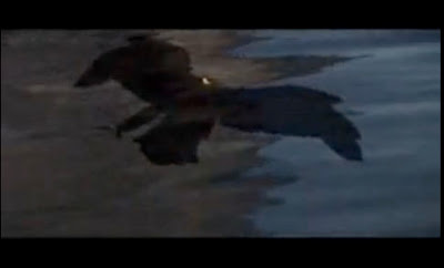
Next reflected in the water we see a Bird of Pray, possibly a Peregrine Falcon; a bird I found out in my research, is indigenous to the Cape Fear region. [4] This menacing bird descends upon and swoops just past us to reveal Robert De Niro's name. This is important for two reasons.

1. it prepares the audience to see De Niro as a vicious predator, descending on the innocent family and tearing them apart in the film. 

2. It's not the first time Bass has used an animal to capture the idea of a character in a film. The first time was when he used a black cat to embody the spirit of the main character "Kitty Twist", played by Jane Fonda, in the 1962 film Walk on the Wild Side. This self-referencing is done a few times throughout the opening titles of Cape Fear.


Another self-reference is the fractured type, used to convey the tone of the film. Bass used this technique in his film titles for Psycho.


As the title of the film appears, and then sinks into the dark water, we see an unsettling image of an eye looking up at us from the abyss.


As the face emerges  from the deep, we see a mouth form, and teeth show almost animal like, in the lower part of the screen. This also foreshadows a pivotal seen later in the film.


The face almost comes into full view before disappearing back into the depths of the water.


As the opening progresses, we see a shadowy image of a torso come straight towards us from out of the depths.


Next is a droplet of what we are to see as blood, into the water turning it red with vengeance.


Another set of eyes appear from the red of the water. Was concentrating on the eyes of characters in this opening title a self-reference to his work on the opening of Vertigo, or was it a nod to Scorsese and the opening of Taxi Driver? I'm not sure, but it's very effective.


We soon realize that the new set of eyes are that of an innocent young girl, Danielle Bowden, played by Juliette Lewis and she begins to speak.

"My reminiscence. I always thought that for such a lovely river the name is mystifying: "Cape Fear". When the only thing to fear on those enchanted summer nights was that the magic would end and real life would come crashing in."

(Cape Fear title sequence link)


References
------------------------------------------------------------------------
 [1] - [3]: Wikipedia   http://en.wikipedia.org/wiki/Cape_Fear_%281991_film%29

[2]: Wikipedia   http://en.wikipedia.org/wiki/Cape_Fear_River

[4]: Star News Online  http://critters.blogs.starnewsonline.com/12384/birds-of-prey-to-be-featured-at-halyburton-park/